Using Color Psychology on Your eCommerce Site: Expert Tips + Examples
Colors can speak volumes. That's why it's important to choose the right color scheme for your eCommerce store and merchandising strategies. Find out how to effectively communicate with your customers through the color wheel.
Updated December 15, 2025

Using color psychology on your eCommerce site is a visual merchandising method that impacts user behavior. A study shows that up to 90% of a consumer's initial assessment before making a purchase is based on color. Using color to ignite certain emotions and associations in the user can be a powerful tool for guiding user behavior. Follow these expert tips and examples to add some color to your eCommerce site.
Consider Your Industry & Target Audience
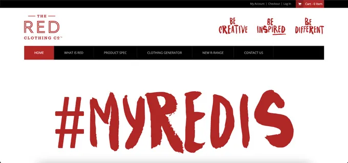
Certain colors can be used to attract target consumers. For example, red on fashion and retail websites creates a sense of urgency and excitement. This can help encourage conversions, which can increase profits.
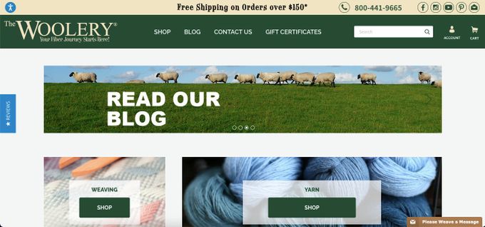
Additionally, personality types can also play a role. A research journal reveals that green can inspire creativity and is more associated with less urgent calls for action. For example, The Woolery uses green and appeals to those interested in the knitting craft.
» Find out how visual merchandising can create an engaging eCommerce experience
How Color Can Help Achieve Your Desired Effect
With well-considered color choices, you optimize customer experience, communicate your brand's message, and even sway customers' actions.
1. Prompt Action With Red
Red is known to be an attention-grabbing color. HubSpot ran an A/B testing study, which depicts how red is a suitable choice for CTAs, achieving a 21% conversion rate.
Fragrance Buy: Red-y, Set, Buy
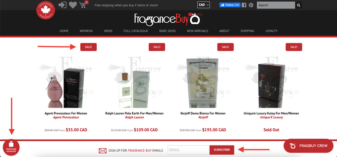
Fragrance Buy, a brand-name fragrance wholesaler, encourages actions such as subscriptions and draws attention to sales, which can drive conversions. Additionally, pulling focus to a "Perfume Advisor" option can incite trust in the business, which can help boost sales.
2. Establish Trust With Blue
Adobe notes that blue can evoke security, trustworthiness, and calmness. It can be a useful color to assign credibility, which can create customer loyalty.
Mastermind Toys: Keep Your Peace of Mind
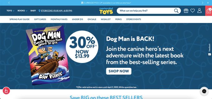
Mastermind Toys is a toy and children's book store. By using blue throughout their site, parents—undoubtedly a large part of the target audience—can feel reassured and secure in purchasing products for their children. Pairing blue with red for the online shopping cart draws attention to the idea of completing a purchase.
3. Spark Enthusiasm With Yellow
ColorPsychology.org points out that yellow typically expresses optimism, confidence, and problem-solving. Its boldness and warmth can be effective if your products or services focus on accessibility.
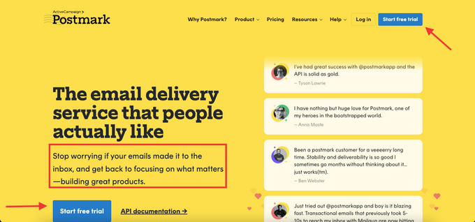
Postmark: Say Yellow to Great Service
Postmark's use of yellow and their reassuring copy can inspire confidence in their service. Because yellow is bright, using a less urgent color than red for the CTAs can encourage permission for action and prevent users from feeling overwhelmed. Also, blue is complementary to yellow, which can connote strong brand cohesion and polish.
» Need help? Discover critical online visual merchandising strategies to drive sales now
Using Color for Fast Engagement
Leveraging color psychology in your eCommerce site design lets you choose the right color pairings based on your industry, demographic, and product offerings. This way, you can communicate your brand message clearly and drive desired user engagement, customer loyalty, and conversions.
