eCommerce Product Pages: 5 Best Practices to Improve Online Merchandising
Updated December 12, 2025

Product pages can make or break a sale. This is where you showcase your products in the best possible light to convince potential customers to become paying customers. Below, we list and discuss five best practices you can apply to your eCommerce product pages to improve your online merchandising techniques and ultimately boost your sales.
1. Use High-Quality Product Images
Visual appeal has a high impact. About 85% of your customers feel product images are important to help them make their purchase decisions. Your customers must be able to picture the product and its quality clearly, as well as understand how it will fit into their lives, before buying it.
Here are some tips for selecting and displaying product images:
- Use high-quality equipment to capture optimal lighting and details.
- Choose angles that showcase the product's best features and unique selling points.
- Provide context through lifestyle images, demonstrations, or showing the product in use.
Steve Madden: A Step in the Right Direction
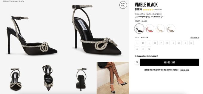
Steve Madden, a global fashion brand, uses multiple images to showcase this pair of high heels from different angles. Plus, there's even an image of someone wearing the shoes.
This allows customers to get a full idea of the shape and details of the product. It also helps customers imagine how they could wear it if they were to make the purchase. Attention to detail and keeping the customer informed visually by using a display merchandising optimizer can help you improve conversions.
» Want to improve search? Find out why your store needs visual discovery
2. Write Clear and Detailed Product Descriptions
Product descriptions should provide a laser-sharp idea of your product's specifications, like ingredients, materials, dimensions, and weight. You can even try to incorporate storytelling elements to engage and meet your shoppers' intent.
Enticing product descriptions can include:
- Descriptive, specific language that paints a picture of the product and its uses.
- Simple language that's easy to understand for any audience.
- Benefits that show how the product can improve your customer's life.
- Bullet points and formatting that are easy to read and digest.
Spiceology: A Dash of Engaging Details
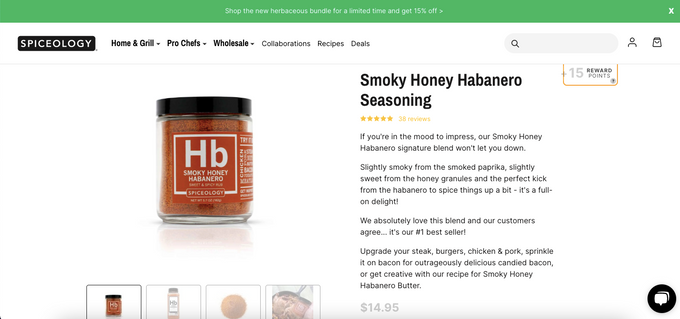
Spiceology, a spice and herbs store, provides creative copy to engage customers. It mentions ingredients, foods the seasoning can be used on, and information about how well the product sells.
This combination can excite and inspire customers to use this product in their own cooking, which can increase the chance of a purchase.
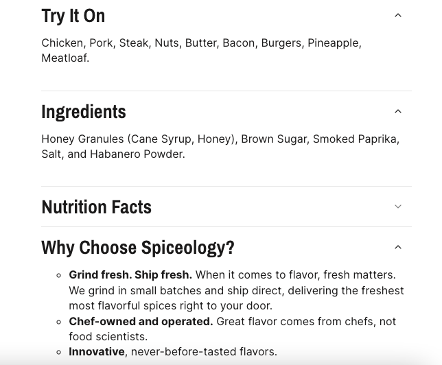
Additionally, Spiceology also includes collapsible sub-sections that include bulleted lists on their product images. These provide a summarized, easy-to-digest view of the copy. This can be perfect for those skimming for key information before making a purchase.
3. Include Product Reviews and Ratings
With more than 99.9% of customers reading reviews when shopping online, it's crucial to make these readily available. Social proof, like product reviews and ratings, is a top-tier way to show your customers that they can trust you and the products you sell.
Some tips for building trust through your product reviews and ratings are:
- Respond to customer feedback, both positive and negative.
- Use star ratings and customer comments to showcase the overall product experience.
Targus: It's in the Bag
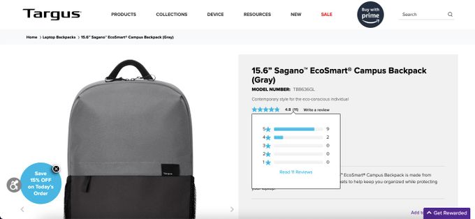
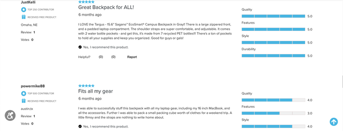
Targus, an electronics and accessories brand, helps encourage purchases with easy-to-access and detailed reviews. From any product page, you can easily click on the review and rating.
This then auto-directs you lower on the page, where average ratings based on categories like "Quality" and an overview of customer review images are included.
Then, for even further detail, each of the reviews appears in full with ratings and whether the past customer recommends the product.
» Learn the importance of personalization in your eCommerce strategy using reviews
4. Highlight Calls-to-Action
Your calls-to-action (CTAs) should be clear and concise for more efficient online visual merchandising, so you can guide your customer intuitively through the purchasing steps.
Here are a few ways you can implement effective CTAs:
- CTAs should be clear about what action the customer is expected to complete.
Zachys: Pour Us Some Clear CTAs
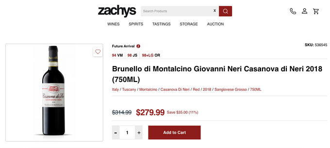
Zachys, a wine and liquor store, uses deep red for the CTA, which stands out against the white background and matches other design elements on the page, such as the search button and price. Additionally, the color can allude to red wine, which fits their product offerings.
The standout CTA helps guide the customer to complete a purchase. Plus, the CTA is clear about what it does with "Add to Cart" marked on it.
5. Personalize Product Recommendations
Product recommendations are key to successful upselling and cross-selling, which are fundamental methods to help boost your average order value (AOV) and overall revenue.
Some tips for identifying products to upsell or cross-sell are as follows:
- Use personalized recommendations based on the customer's previous purchases or browsing history.
- Evaluate data analytics to find related products that other customers have purchased with the main product.
- Offer bundles and promotions that include products that can be used alongside the main product.
Princess Polly: Complete the Look in One Sale
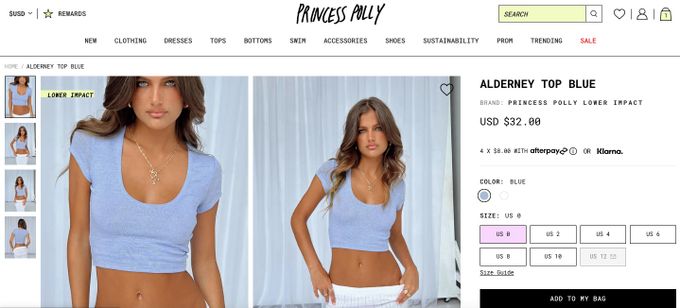
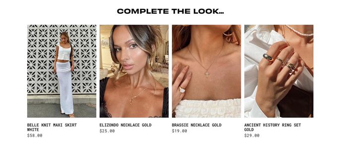
Princess Polly, an online fashion retailer, uses personalization based on each customer's previously clicked history, which can inspire larger AOVs. By including a "Complete the Look" section on each product page, they have the opportunity to cross-sell to their customers by suggesting other products that can be worn with the particular item being viewed.
Plus, by offering options, like two similar necklaces, the brand gives their customers a choice. Because the necklaces are priced differently, Steve Madden also has the chance to upsell the more expensive necklace.
» Learn more about the benefits of upsell and cross-sell personalization
The Power of Effective Online Merchandising
Online merchandising can make or break your eCommerce store. When you use the right strategies, you'll see a boost in sales and even . But remember that your store and customers are unique, so don't worry if what works for one brand doesn't work for you. Put these online merchandising best practices to the test and personalize them for your store and customers to increase your conversions.
