Responsive Web Design: Craft a Seamless eCommerce UX (+ Examples)
Accommodate all of your customers' shopping habits, regardless of their device, with a responsive web design.
Updated November 19, 2024.

Did you know that 88% of online consumers are less likely to return to a site after a bad user experience? In today's supercharged digital age, using virtual merchandising techniques, such as responsive web design, to craft a seamless eCommerce UX is a necessity.
More consumers than ever are shopping on different types of devices, so your web design must be able to respond to your customers' needs.
What Is Responsive Web Design?
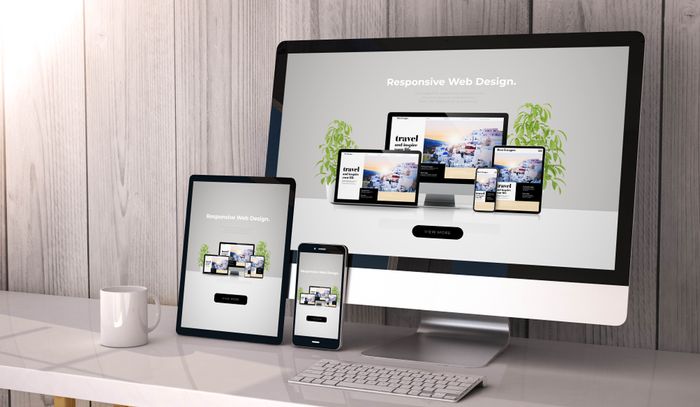
Responsive web design allows web content to adapt how it is displayed based on the user's device, window size, and screen size.
The user's browser will detect the device being used and morph the site's layout. This can include altering the layout to optimize the site's text, images, and other design elements for the screen. For example, condensing three columns on a desktop version to one easy-to-scroll column for mobile.
eCommerce sites that can standardize the user experience with seamless functionality between different devices can achieve:
- Happier customers
- Streamlined engagement
- More conversions
» Consider the differences between adaptive vs. responsive design
1. Mobile-First Design Strategy
A mobile-first design strategy prioritizes the web page design for mobile, then adapts it for larger screens. This way, you can avoid:
- Glitches
- Irregular displays
- Broken images
- Other technical issues that occur when you design for desktop size first
A mobile-first design strategy leads to faster site speeds and an overall better user experience. Here are some of the core focuses when using this strategy:
- Minimal design
- Visual hierarchies
- Content-focused
- Bold, consistent CTAs
- Grid systems
- Touch navigation
Targus: Geared Up And User-Friendly
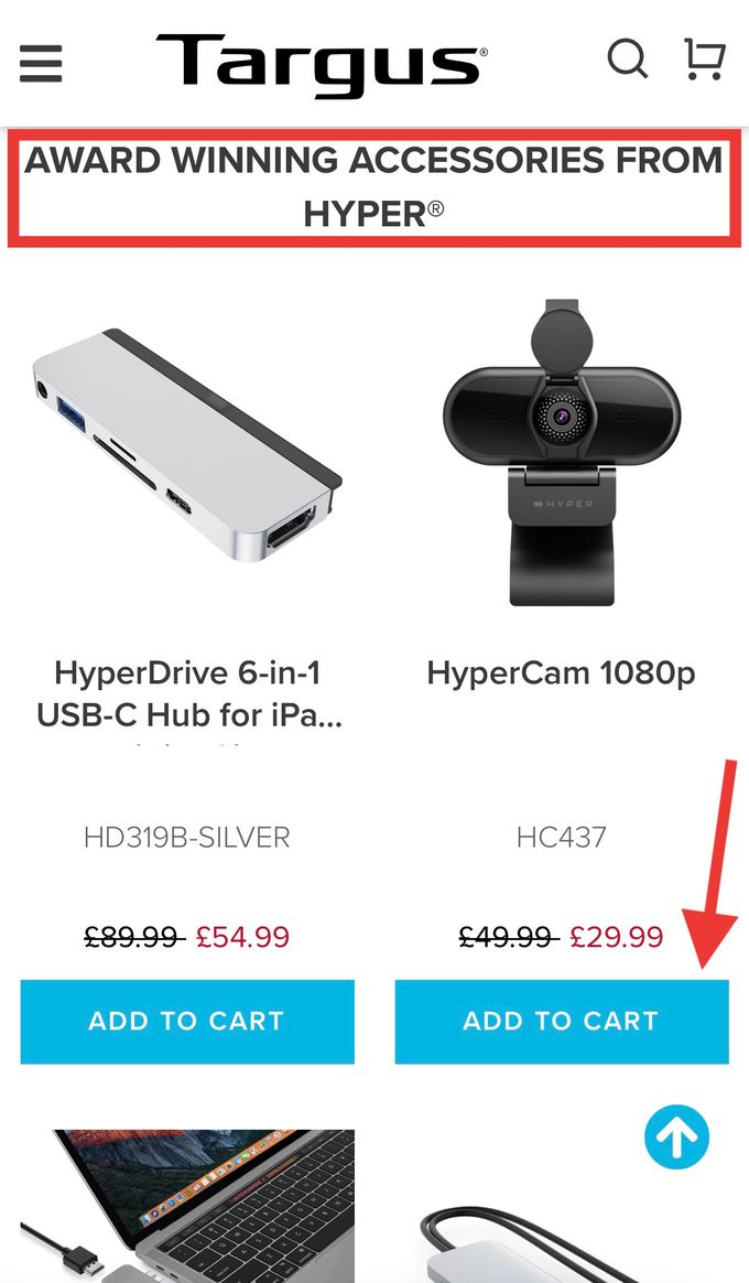
Targus, an electronics and accessories store, effectively implements a mobile-first design strategy with large, easy-to-click blue CTAs and capitalized headings to guide the user through the page. The site uses visual hierarchies, minimal design, and touch navigation for an overall better user experience.
» See why customers are leaving your eCommerce store and how to make them stay
2. Flexible Grids and Images
Flexible grids and image use can fortify your visual merchandising techniques, which can help boost conversions and create long-lasting customer relationships. This also allows the web pages to adjust to the customers' browsing behaviors.
Flexible grids are a method of dividing a page into multiple columns and rows, which you then pop your content and user interface (UI) elements into.
Zachys: Brimmed With Variety
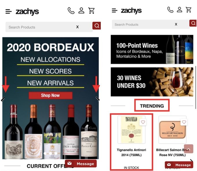
Zachys is a family-owned eCommerce store that sells wines and spirits. Their site highlights how flexible grids can be used to create a visually appealing and functional mobile site.
Its fluid layout with columns (see on the right) and different image sizes gives an intuitive way to engage with the product offerings. Combined with the use of bold heading fonts and easy navigation, like side arrows, the layout offers a visually stimulating experience that entices users to explore more and convert.
Tip: To accomplish flexible grids, you can use percentages instead of fixed pixel widths when designing a page.
» Explore this helpful list of the best eCommerce merchandising strategies and practices
3. Navigation and Menus
Clear and intuitive site search capabilities help create smart collections on your site, which can boost conversions because users can explore your page effortlessly and intuitively. An effective path is what users will take to get to know your brand, browse through your inventory, and eventually make a purchase.
A common menu technique that works across different devices is the hamburger menu.
A hamburger menu is an interactive visual that consists of three horizontally stacked lines. It allows you to keep a full menu in a compact and expandable format, so it's only visible when users click it.
Other beneficial tips include:
- Using collapsible or expandable dropdown menus and sub-categories.
- Styling with fonts and colors to enforce hierarchies.
- Keeping the design simple and clean to minimize distractions.
- Maintaining consistent navigation and menus across all pages.
» Learn how to create a tailored eCommerce experience with an optimized website
Spiceology: Guided By Spice
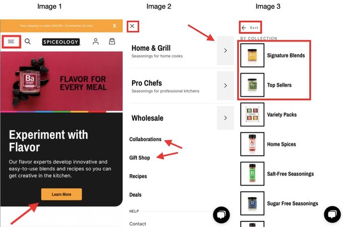
Spiceology, a premium spices and herbs retailer, leverages its visual hierarchy from a navigation, typography, and graphics perspective. This can help them optimize customer experience and drive conversions.
The site maintains consistent navigation, with slight tweaks, like the hamburger menu (see image 1), for mobile. It uses expandable menus and sub-categories with pictures (see images 2 and 3), plus bold CTAs (see image 1) for easier navigation.
The white background and bold black text help users scan without clutter distracting them. Using varying expansion types and heading sizes enforces a desired conversion hierarchy. This refers to the expandable headings (see image 2) being the main product categories and the smaller headings highlighting other site features less aligned with higher sales and conversions.
Benefits of Responsive Web Design
This design strategy offers the following positives that can lead to higher engagement and conversions:
- Improved user experience: Ensures a seamless user experience across all devices.
- Increased reach: Research shows about 76% of Americans make purchases only on mobile devices. Responsive web design enables your site to seamlessly reach users on various device types.
- Cost-effectiveness: Eliminates the need for separate mobile and desktop sites, which can help lower development and maintenance costs.
- Improved SEO: You can achieve better search engine rankings and visibility by providing a consistent user experience across devices.
» Find out why the eCommerce world is moving to no-code design
Fast Potential For Fast UX
Responsive web design can help you ensure your eCommerce site provides a seamless user experience across various device types. You can adopt multiple fundamentals of this design strategy based on your merchandising and business goals. Understanding user intent and prioritizing user behavior and preferences can contribute to better brand recognition, improved reach and engagement, and more conversions and sales.


