eCommerce Homepage: 4 Best Practices for Promotions (+ Examples)
Make the best of your eCommerce homepage by featuring attention-grabbing promotions and enhancing your merchandising efforts.
Updated December 5, 2024.

Your eCommerce homepage is often the first thing your visitors see, so it's a crucial place to showcase promotions and make sure your eCommerce merchandising is on point. After all, potentially 67% of your visitors can make unplanned purchases based on a promotion. To help you get started, consider these best practices with examples to convert visitors to your eCommerce homepage into customers.
» Looking to optimize your homepage for promotions? Improve your site navigation for better conversions
Benefits of Showcasing Promotions on Your Homepage
- Captures immediate attention: Highlighting promotions at the top of your homepage grabs visitors’ interest and encourages them to explore further.
- Increases conversion rates: Clear and visible offers guide visitors through the buying process, turning casual browsers into paying customers.
- Enhances brand perception: Promotions communicate value and help establish your store as a go-to destination for great deals.
- Builds customer loyalty: Regularly featuring personalized or seasonal deals on the homepage keeps customers returning for more.
» Learn how to drive traffic with promotional tiles
1. Keep It Simple
Simplicity is key when it comes to your eCommerce homepage promotions. Using color strategically and keeping visuals clean helps capture and maintain your customers' attention. If your design is too cluttered, you'll miss the crucial 3-second window to make an impact.
However, if you have a clear, consistent, and concise message, you can drive your customers through the funnel quickly and more efficiently. They'll know exactly what the offer is and what they need to do next.
Amazon: No-Frills Promotions
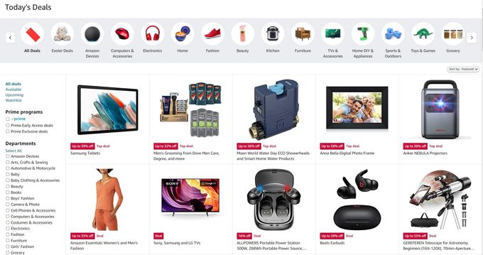
Amazon's "Today's Deals" page does a great job of this. The page starts with categories of products, including a crisp photo with a white background to represent each category. This helps users easily navigate to the types of products they're looking for.
This visual merchandising strategy continues down the page with intuitive organization, clear photos, descriptive titles, and badges that show the percentage discount.
» Enhance your visual merchandising to create an engaging eCommerce experience
2. Highlight the Value Proposition
It's critical that your customers recognize right off the bat that your promotion is worth their time and money. They must be encouraged to take action and convert. You can do this by being clear about the terms of your promotion. If it's a discount, state the percentage or dollar value clearly up front. Don't make them fish around for the most relevant information.
Sephora: The Beauty of a Good Deal
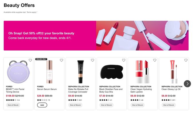
Sephora's "Beauty Offers" section states the 50% discount in a bright pink bar across the top of the page. This also includes how long the promotion is running, which further grabs the customers' attention and piques their interest.
Pro Tip: An additional merchandising technique is showing which of the discounted items are already sold out by using an "Out of Stock" button instead of an "Add" button. This builds extra value for customers, creating the impression that these items are so hot they'll be gone soon if customers don't act fast.
» Ensure your promotions stand out and drive traffic with promotional tiles
3. Create a Sense of Urgency
When your message instills a sense of urgency and limited supply, your customers are less likely to say, "Maybe later..." and more likely to say, "Gotta have it!" You can create urgency through the "limited time offer" or "limited stock left" sections on your eCommerce homepage.
H&M: Not Fashionably Late
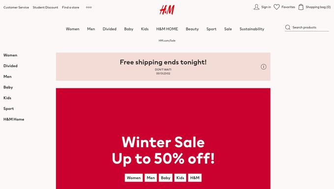
H&M chose to offer free shipping on orders for a limited time. This is communicated through a banner that runs across the top of the screen, claiming, "Free shipping ends tonight!" To drive home the urgency of the offer further, H&M includes a countdown timer that shows how many hours are left until the promotion expires. This is a classic eCommerce strategy to alert shoppers that the good deals won't last.
Underneath this, another brighter banner advertises the Winter Sale, which gives access to deals up to 50% off. Combined, these two banners create a visual hierarchy that packs a powerful punch to create urgency and nudge shoppers to make a purchase they otherwise may not have made.
» Implement these critical visual merchandising strategies to drive sales
4. Personalize Promotions
Personalization in eCommerce can help you stand out from the competition and build strong relationships with customers. It also assures customers that you "get them" and understand what they're looking for when they shop.
Netflix: Personalize Your Watchlist
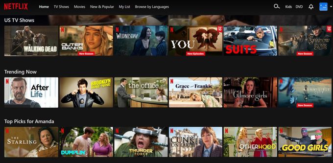
Netflix runs on one of the most successful and well-known personalization engines in the world. It churns out a never-ending list of suggestions based on titles you've already watched as well as titles that are popular in certain regions and within certain categories. It keeps people locked in for hours of viewing.
» Delve deeper into how personalization can help merchandising
Maximize Your eCommerce Success the Fast Way
Effective eCommerce homepage promotions can be a game-changer if you want to attract and retain customers. When executed well, they can paint a bright, vivid picture for your customers about the opportunities and deals they have access to.
By implementing these merchandising strategies and best practices, you can deliver an incredible user experience, draw your customers in, lead them to exactly what they're looking for, and keep them coming back for more.
» Book a demo to learn more about our AI-powered eCommerce solutions
FAQ: eCommerce Homepage Promotions
What are some effective types of homepage promotions?
Popular options include flash sales, percentage discounts, free shipping, seasonal offers, and exclusive deals for members.
How often should I update homepage promotions?
Regular updates are key to keeping your site fresh and engaging. Aim to update promotions weekly or align them with seasonal campaigns, holidays, or new product launches to stay relevant and entice repeat visitors.
How can I make my promotions stand out?
Should promotions be highlighted on mobile as well?
Absolutely! Since many customers shop on mobile devices, ensure promotions are mobile-friendly with responsive designs, fast load times, and prominent placement to create a seamless browsing experience.


