How to Effectively Display Product Variants on Your eCommerce Store
Use these top tips to ensure that your customers know exactly what's on offer.
Updated December 15, 2025

Displaying your product variants in an appealing, user-friendly way is a critical component of good eCommerce merchandising. Well-organized product variants that are easy to navigate can improve customer engagement and conversion rates. If you don't already have a display merchandising optimizer, let's go over a few strategies you can use to effectively display product variants on your eCommerce store.
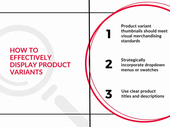
1. Product Variant Thumbnails Should Meet Visual Merchandising Standards
Compelling, descriptive, and visually appealing thumbnail images are a great way to display product variants. Your customers should be able to easily differentiate between the choices, so make sure:
- Each thumbnail is clear and easy to see
- Each thumbnail is the same size
- All thumbnails are aligned
Consistency is key. Different sizes and alignments make your store look unorganized, inconsistent, and even untrustworthy. By optimizing your visual merchandising elements, your customers can easily view your product offerings and make buying decisions.
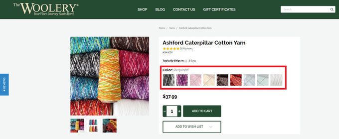
The Woolery uses bright, distinct thumbnails to distinguish between its different color variations of Ashford Caterpillar Cotton Yarn. As an added feature, they also grey out the out-of-stock variants.
» Here's how to craft an effective visual merchandising plan
2. Strategically Incorporate Dropdown Menus or Swatches
Dropdown menus and swatches can also improve product variant navigation by helping you group your variants. But how to choose which one?
- Dropdown menus are best for when you're displaying variants with numerous options, like different sizes, colors, and materials.
- Swatches are better for a smaller, less complex number of options, like if a product only comes in different colors without any other choices.
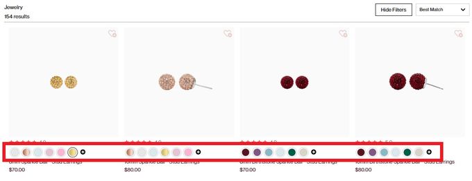
Hillberg & Berk uses color swatches to show which colors their jewelry is available in. Hovering over the color swatch shows a new thumbnail of the item in that color.
» Not sure where to place your menus and swatches? Enhance your merchandising efforts with visual hierarchy.
3. Use Clear Product Titles and Descriptions
We can't stress enough how important descriptive and informative product titles are. How else will your customers know if you have what they're looking for? Try:
- Including variant-specific details in the title, such as color and size.
- Using concise and relevant product descriptions that highlight the unique characteristics of each variant.
This way, customers won't need to search for information — they'll know just what they're getting.
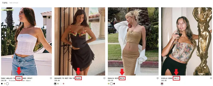
Princess Polly lists the product color in the product variant's name so customers know what to expect.
Fast-Track Your eCommerce Store With Optimal Product Variant Display
It's critical to effectively display your product variants if you want to enhance the customer's shopping experience. As we've discussed here, a few tips for doing so are using
- Thumbnail images
- Dropdown menus and swatches
- Clear descriptions for better visual representation
These changes can help you have a more user-friendly interface that ultimately drives higher sales.
» Take your product variants to the next level with personalization: Learn how to personalize product recommendations


