How Whitespace Brings Focus to Your eCommerce Website
Enhance your visual merchandising efforts by strategically using whitespace on your eCommerce website.
Updated November 19, 2024.

Whitespace in eCommerce merchandising brings focus to products or call-to-action buttons on your eCommerce website. So by using whitespace effectively, you'll be able to create a visually appealing experience that encourages customers to stay and engage with your products.
Using Whitespace to Pull Focus
Whitespace, also known as negative space, refers to the empty space between design elements and paragraphs on a web page.
Veer Away From Busy Spaces in Visual Merchandising
Ineffective use of whitespace in merchandising includes a cluttered page layout and no clear visual hierarchy. When too many design elements compete for your customers' attention, it can be challenging to get them to focus on your products.
Tip: Treating whitespace in tandem with other design elements, like margins, the site search bar's placement, and typography, can elevate your website's visual merchandising.
» Learn how understanding shoppers' intent can maximize e-commerce conversion
Steer Toward Whitespace in Visual Merchandising
According to research, whitespace can aid in readability and customers' perceptions of your brand. So, effective use of whitespace in visual merchandising allows you to frame or pull focus to product images, descriptions, and other website elements easily by building an apparent visual hierarchy that can guide and encourage conversions and further site exploration.
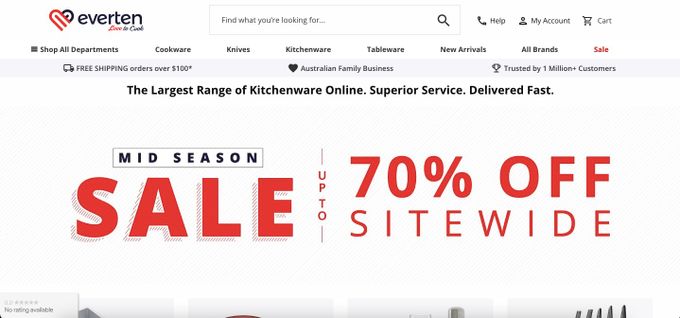
For example, Everten, a kitchenware store, leverages whitespace to highlight the seasonal focus of its products. During a sale, using the stark contrast between white, red, and black can effectively direct customers to the most important leads on their web page.
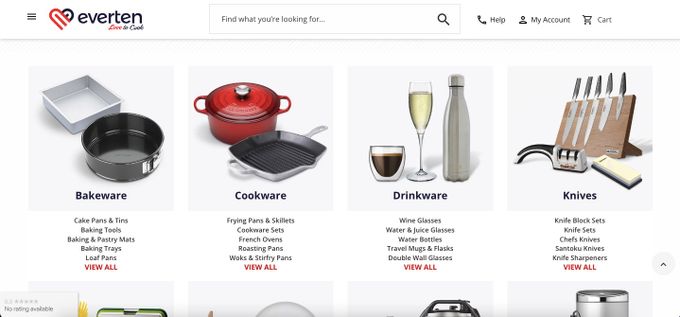
The whitespace here also acts as a framing tool to help product categories stand out so that customers can navigate the site intuitively. This framing creates a sense of balance in the overall web page design, which can create a harmonious brand perception that can drive customer loyalty.
» Check out this helpful list of e-commerce merchandising best strategies
Fast Focus With Whitespace
Whitespace can be a powerful tool for your e-commerce website by making it user-friendly and creating aesthetically pleasing content that's easy to digest. This visual merchandising technique can help you draw a customer's attention to specific products or call-to-action buttons.
Optimizing site navigation through a clear visual hierarchy, like on-site search bars bordered by whitespace, can help your website traffic translate into higher conversions and sales.

