eCommerce Web Design: How to Create the Best eCommerce Website Layouts for 2025
A user-friendly web design can be the difference between securing a sale and losing it. Find out how to create the best website layout for your eCommerce store.
Updated November 19, 2024.

First impressions matter. In fact, 94% of your customers' first impressions of your website are layout and design-related. So, revamping your eCommerce site to create an irresistible layout and merchandising strategy can be the first step toward boosting your conversions and keeping your customers coming back for more.
Why Should You Have a Great Store Layout?
Your store's layout affects your customers' entire shopping experience. A well-designed layout can help you:
- Showcase your products effectively
- Make navigation easy
- Guide your customers toward purchasing
It can also improve customer engagement and increase loyalty, leading to higher conversion rates and increased revenue. This isn't lip service: a study by Adobe showed that 59% of people prefer browsing 'beautifully designed' sites to 'simple and plain' ones.
Tip: Get constant customer feedback and A/B split test changes in your eCommerce site layout to create the perfect design.
Understanding Your Target Audience
Knowing your target audience is crucial when designing your eCommerce site because you can tailor the layout to their needs and preferences. If you know what your customers are looking for and how they like to shop, you can create a layout that resonates with them.
Here are some specific examples of how understanding your target audience can inform your site design:
Design for Mobile
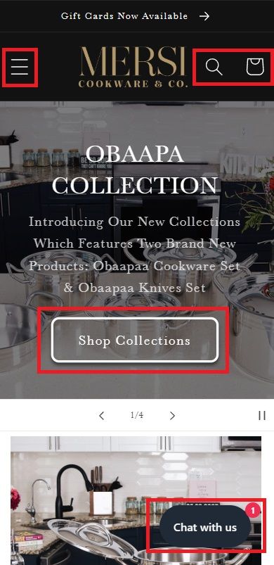
If your target audience is primarily mobile shoppers, your site should be optimized for mobile devices. This means using responsive design, simplifying your layout, and prioritizing quick load times. For example, Mersi Cookware & Co. targets moms, so they include large, high-quality lifestyle images and large buttons that are easy to view and click on a mobile device.
Tip: If you need help determining the percentage of your mobile users, check your Google Analytics for the answer.
» Ensure your eCommerce merchandising is optimized for m-commerce
Prioritize Search
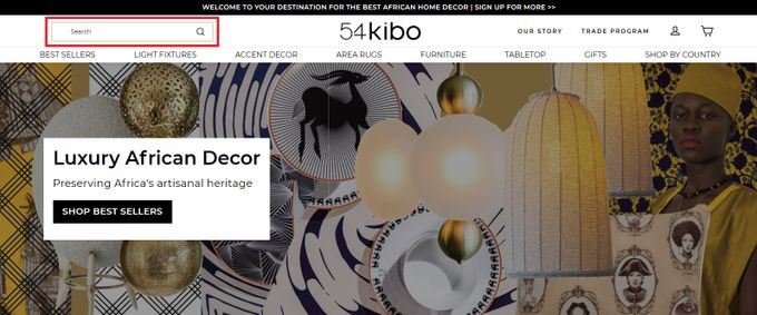
If you find your target audience is looking for specific products on your site, you'll want to make those products easy to find. This means prioritizing the site search functionality on your eCommerce store and making it visible and user-friendly. For example, 54kibo is a home goods store that targets busy parents, so they've included a prominent search bar on the homepage that lets their customers search for the products they need quickly.
» Discover the benefits of eCommerce product engines for your store
Highlight Social Proof
If your target audience is skeptical or values the opinions of others, you need to incorporate social proof into your site design. This can include customer reviews, ratings, or testimonials that demonstrate the quality and value of your products.
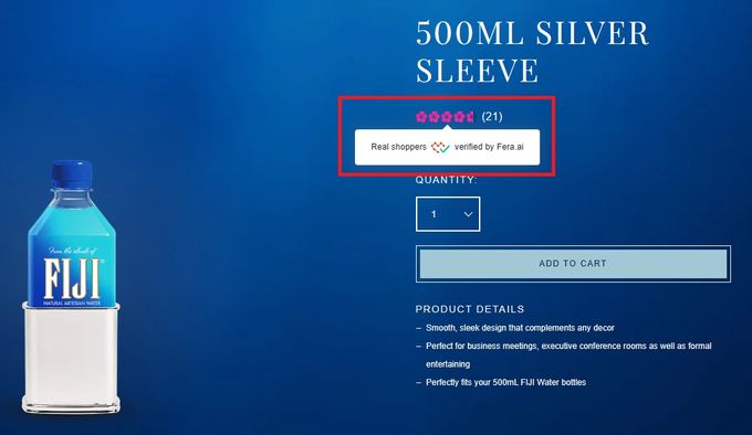
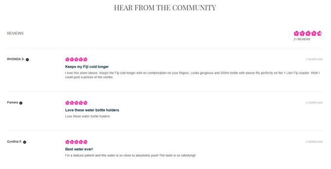
For example, Fiji Water features their customer reviews on their product pages to boost the relevant product's credibility. A customer sees the rating system first, and then it takes them to testimonials when they click on it.
Tip: You can determine if your customers are skeptical about your products by searching for your brand name followed by "reviews" or "unboxing" in Google.
» Enhance your eCommerce and merchandising strategies with personalized reviews
Key Elements of an Irresistible Layout
An irresistible layout for eCommerce stores should be visually appealing, easy to navigate, and optimized for conversions.
- Clear and intuitive navigation Navigation should be easy and intuitive, with a clear hierarchy of categories and subcategories that allows your shoppers to quickly and easily find what they're looking for.
- High-quality product images Using only the best images is essential for showcasing your products and giving your shoppers a clear idea of what they're buying. These images should be well-lit, high-resolution, and show the product from multiple angles. You should also use a Web format for quick loading times!
- Distinct and consistent color and branding Your eCommerce store's branding should reflect your company's values and personality. This includes a well-designed logo, a cohesive color scheme, and typography.
- Persuasive product descriptions Product descriptions should be compelling and informative to highlight your products' benefits. This helps your shoppers make informed decisions and encourages them to purchase.
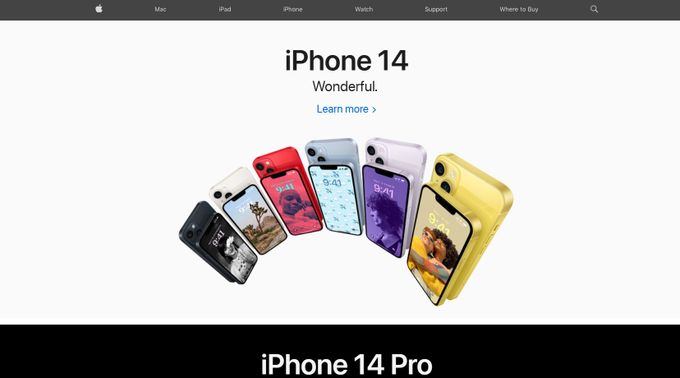
Apple: Customers Like Them Apples
Apple's eCommerce site encompasses the majority of these elements. The site has a sleek and minimalist design with a clear focus on the products. The ample use of white space helps to create a clean and uncluttered layout and highlights the products on display. The product images are large and high-quality, while the calls-to-action are clear and prominent in blue.
Best Practices for Layout Design
Keep It Uncluttered
An uncluttered layout design can help shoppers focus on what's important—your products. Avoid cluttered layouts with too many graphics or distracting elements that can confuse or overwhelm your visitors.
Use White Space
White space, or the empty space around design elements, can help create a clean, organized layout that's easy to navigate. It also draws attention to the key elements of your site, such as your products and call-to-action buttons.
Follow a Grid System
Using a grid system can help you create a balanced and visually appealing layout. A grid system can help you ensure that your design elements are aligned, consistent, and easy to follow.
Make It Accessible
Accessibility is crucial in eCommerce. You can follow these tips to ensure your site is accessible:
- Use descriptive alt tags for images.
- Ensure website compatibility with assistive technologies.
- Use high-contrast colors.
- Provide captions and/or transcripts for multimedia content.
- Avoid relying on color alone to convey information.
- Ensure keyboard navigation functionality.
- Test the website with users who have disabilities.
Call-to-Action Buttons
Clear and prominent call-to-action buttons should be used throughout your site to guide shoppers toward buying. Incorporating these key elements into your eCommerce layout will help you create a visually appealing site that is easy to navigate and optimized for conversions.
Fast-Track Your eCommerce Success
Don't let a poor layout design hold back your eCommerce success. By incorporating key elements such as clear branding, easy navigation, high-quality images, and persuasive product descriptions, you can revamp your eCommerce site's layout to engage shoppers and encourage them to make a purchase.
» Dive deeper into this ultimate merchandising guide to drive your store forward
![Successful eCommerce Product Bundling Guide: Strategies, Examples, & Solutions [{year}]](https://entail.fastsimon.com/en-assets/fastsimon/fit-in/280x280/shutterstock_2284746011-1680698370996.jpg)


