Visual Hierarchy: How to Create a Stunning eCommerce UI (+ Examples)
Updated December 15, 2025

How your website is designed, including your merchandising efforts, greatly impacts customer behavior and sales. By implementing visual hierarchy, you can create a stunning eCommerce UI (user interface) for your customers that can ultimately help you enhance their experience, increase conversions, and drive sales.
Boosting Your eCommerce UI Through Visual Hierarchy
1. Pull Focus With Size and Scale
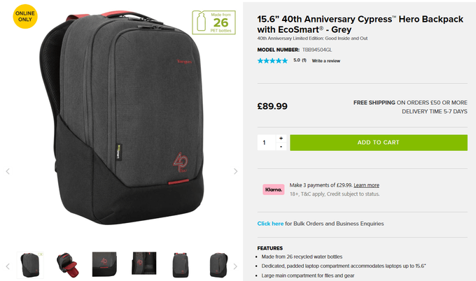
Size and scale are powerful tools for creating a visual hierarchy because they can help certain features stand out. Based on customers' reading behavior, they'll view the biggest visual element first. But size is still relative—without scale, your important sections may lose their impact.
For example, while Targus's merchandising of this product splits customers' screens into two equal parts, their eye is immediately drawn to the main product image on the left. The image itself is large but appears more prominent because of the smaller scale of the other merchandising elements, like the smaller product images at the bottom of the screen.
2. Use Color and Contrast for Emphasis
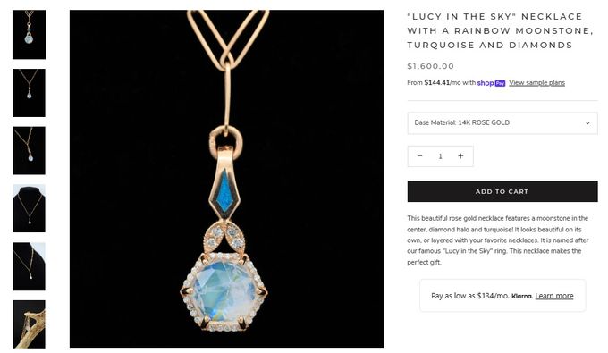
The effective use of color and contrast can help guide your customers' attention to the most important elements, such as calls-to-action, product images, and pricing. By limiting your color palette and using contrasting colors, you can easily improve your visual merchandising and eCommerce UI.
For example, Staghead Designs makes an immediate impact with monochrome product pages. The black background of the main product image instantly makes it the focal point while simultaneously letting the blue pendant shine. Additionally, the bold, black "Add to Cart" button also draws attention, encouraging conversions.
» Follow these eCommerce merchandising best practices to improve the UI more
3. Guide the User With Spacing
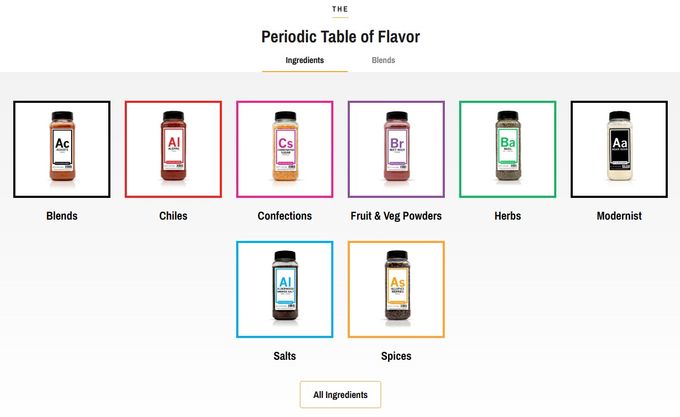
Spacing, or the use of whitespace, can be a powerful tool for establishing a clear visual hierarchy and improving your overall eCommerce merchandising. By increasing the amount of whitespace around important elements (such as headings or call-to-action buttons), you can guide your customers' attention to those elements and create a more intuitive eCommerce UI.
For example, Spiceology uses ample whitespace to place their product merchandising at the top of their visual hierarchy. The equal spacing between the product images also creates balance. Interestingly, the product images are placed in an inverted pyramid shape, which naturally draws the customers' eyes to the "All Ingredients" button, encouraging them to shop further.
» Need to fine-tune your product layout? Use a product grid to improve your eCommerce merchandising
Drive Your eCommerce UI Upwards
Visual hierarchy principles are essential for creating refined eCommerce UIs that prioritize your customers' experience and drive conversions. At the same time, these principles can also help you improve your merchandising techniques, thereby simplifying your customers' overall journey and making it easier for them to find what they're looking for.
» Explore further how visual merchandising creates an engaging eCommerce experience


