Improve Your eCommerce Merchandising With an Effective Product Grid
Product grids are an effective way to add structure to your eCommerce merchandising efforts. Explore the ins and outs of the most popular product grids to choose the best one for your eCommerce store.
Updated November 19, 2024.

eCommerce merchandising, particularly product layout, plays an important role in shaping the overall experience of your eCommerce store. A well-designed and intuitive layout can improve the navigation and visual appeal of your website. But where do you start? By implementing an effective product grid suited to your products and customers' behavior.
Choosing an Effective Product Grid
A product grid in eCommerce merchandising refers to how you present your product listings to your customers in your online store.
The most effective grid will depend on the nature of your featured products. Its main goal is to showcase your products as efficiently as possible and help your customers compare different products.
1. Column Product Grid
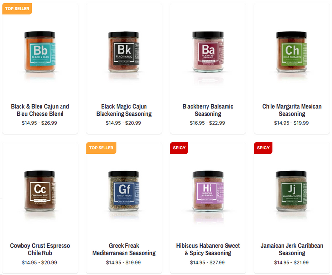
A column product grid is exactly what it sounds like: presenting your products in a column layout. This divides your customers' screens into equal blocks and creates uniformity in your store, making browsing so much easier because your customers aren't overwhelmed or distracted by other elements.
Tip: Don't try to squeeze too many columns into your product grid. Keeping between 3-4 columns is the sweet spot.
Spiceology: Spice Up Your Product Layout
Spiceology sells various blends of seasonings. A column product grid is best suited for their store because the most important feature they need to showcase is the color-coded label. The product packaging is so straightforward that it effortlessly creates uniformity in the product grid and makes finding the ideal spice a breeze. Plus, any marketing banners like "Top Seller" and "Spicy" stand out immediately to persuade shoppers.
2. Modular Product Grid
Modular product grids are versatile. They can span the entire width of your store, whether with one image or populating the space with different-sized images (or modules). This product layout offers a balance between product density and visual clarity.
Zachys: Find the Best Blend
Zachys sells various wines and liquors, meaning Zachys doesn't just sell a product but also an experience. Therefore, a modular product grid is a flexible option to best showcase their products with custom images and text to catch a shopper's attention, whether the hook is a product debut, seasonality, or price.
3. Hierarchical Product Grid
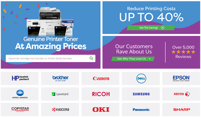
A hierarchical product grid can be a combination of columns, rows, and modules. But your most important elements should either be placed at the top or take up the grid's biggest pieces. This product layout can present products more dynamically and highlight your most essential information.
Tip: Use A/B testing to optimize your eCommerce merchandising based on data.
Tonerbuzz: Set the Right Tone
Tonerbuzz sells various toner brands for different types of printers. Their hierarchy is based on customer behavior. The biggest module on the product grid is the search bar, because it's the quickest way to lead the customers directly to their desired product. Also, instead of bombarding the customers with endless lists of toner and ink, they can search by brand in a simple column grid.
Make Fast Changes to Your eCommerce Merchandising
Choosing an effective product grid can be a powerful way to boost your eCommerce merchandising efforts. A well-designed product grid can improve customer experience, increase customer retention, and generate more sales. Investing time and resources into selecting the right product grid can pay off significantly in the long run, making it a critical element of any successful eCommerce website.
» Discover how AI-driven merchandising can boost conversions


