
Inspire Every Shopper Interaction to Increase Revenue
Unified AI Product Discovery: Merchandising, Personalization, Search, and Shopping Assistants that Deliver Sustained increases in conversion, AOV, and revenue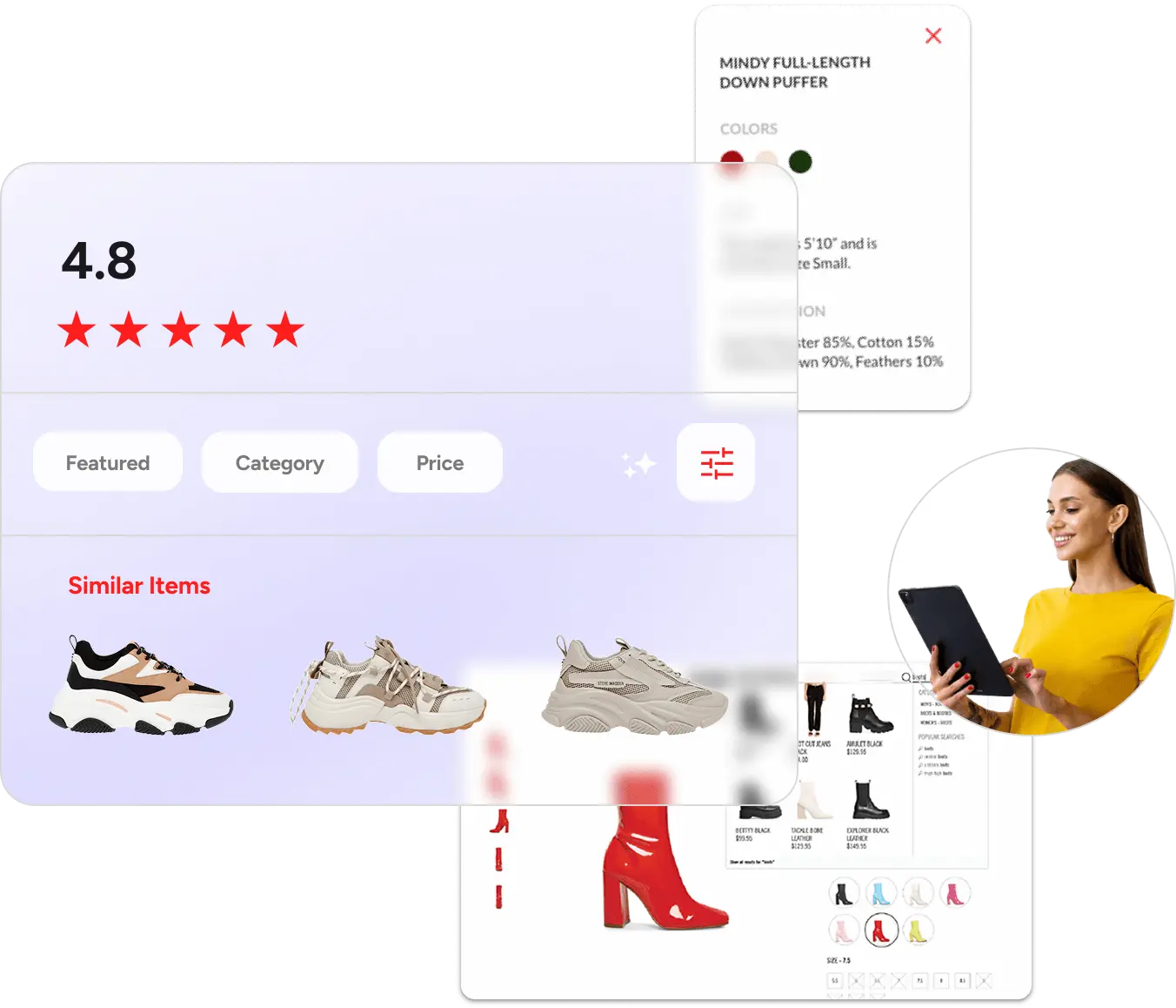

Selected by over 20K stores worldwide including
AI Shopping Agents
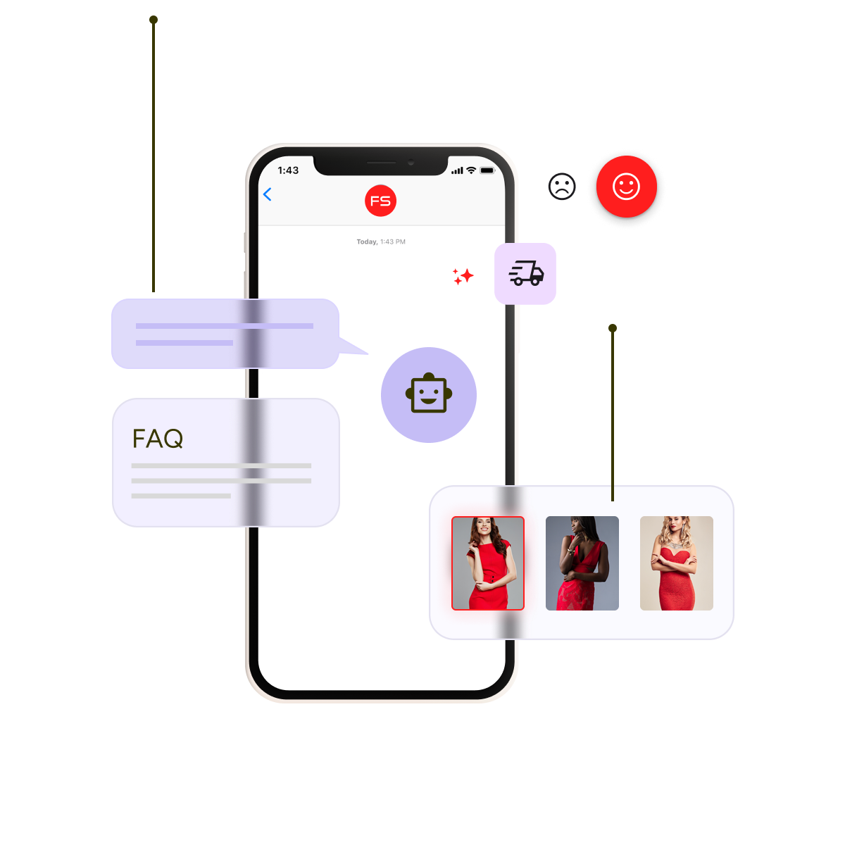
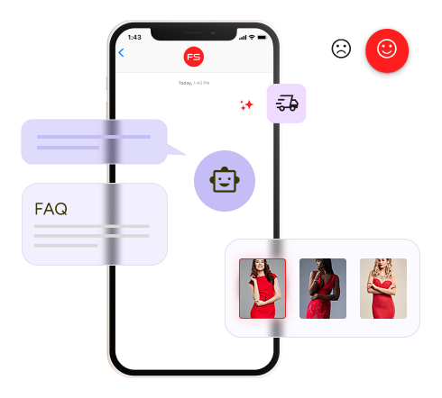
Turn product discovery into a natural, engaging conversation a la Chat GPT.
Fast Simon provides you with AI that works out of the box, not AI that you have to build yourself, so you can boost conversions, reduce friction, and create smarter shopping experiences.
-
Natural language conversation.
Blends smoothly with merchandising rules and Visual Discovery.
-
1
Natural language conversation.
Blends smoothly with merchandising rules and Visual Discovery.
-
Build Smart Conversations into Your Store.
Shop Similar, Shop Alternative, Shop The Look, Visual Search.
-
2
Build Smart Conversations into Your Store.
Shop Similar, Shop Alternative, Shop The Look, Visual Search.
AI Merchandising for E‑Commerce Teams
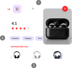
Customize Your Display To Inspire Shoppers.
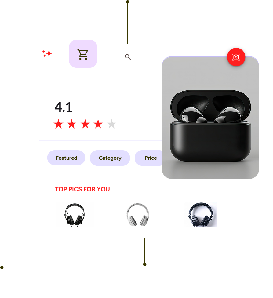
Optimize collections, sorting, product ranking, display and images with the most advanced AI.
-
Optimize Your Collections to Sell.
AI merchandising by inventory, sales, margin, and more.
-
1
Optimize Your Collections to Sell.
AI merchandising by inventory, sales, margin, and more.
-
Inspire Your Shoppers to Buy.
Automate beauty and imagery with digital precision.
-
2
Inspire Your Shoppers to Buy.
Automate beauty and imagery with digital precision.
-
Expand Your Display Possibilities.
Don't let your product data limit your horizons.
-
3
Expand Your Display Possibilities.
Don't let your product data limit your horizons.
Personalized Customer Shopping Experiences
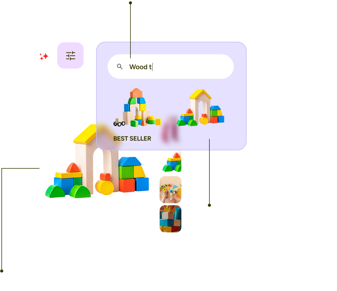
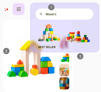
Creating a unique product feed per shopper.
Instant personalized results for your customers, in collections, searches and recommendations.
-
Make it Personal in Real Time.
AI collection & search personalization.
-
1
Make it Personal in Real Time.
AI collection & search personalization.
-
Predict What They are Looking For.
1:1 AI based on session and past behavior.
-
2
Predict What They are Looking For.
1:1 AI based on session and past behavior.
-
Recommend with Confidence.
Unparalleled results based on multi-vector AI.
-
3
Recommend with Confidence.
Unparalleled results based on multi-vector AI.
AI Search & Personalization
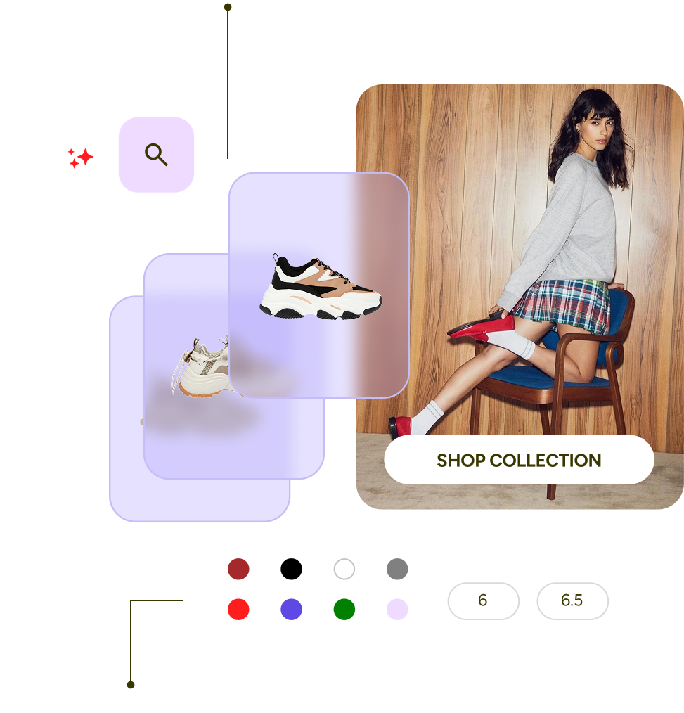
Fastest AI Site Search & AI Filters.
Find shoppers what they want to buy whether they search or explore.
-
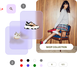
Fast, Awesome Search Experiences.
Predict the items they are looking for.
-
1
Fast, Awesome Search Experiences.
Predict the items they are looking for.
-
Smart Filters that Boost Conversion.
Use AI to create filters that matters.
-
2
Smart Filters that Boost Conversion.
Use AI to create filters that matters.
Visual Discovery
Visual AI for an Innovative Shopper Experience.
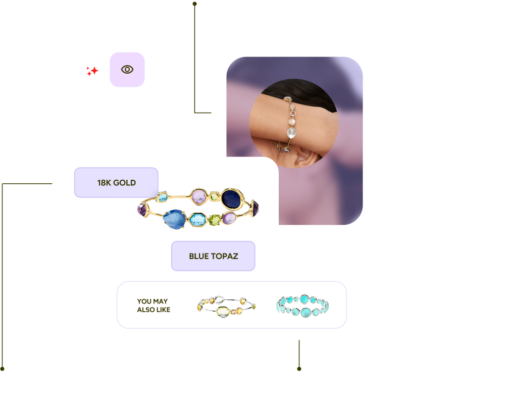
Visual Discovery uses Hyper Tagging, Visual Similarity, Visual Search and Personalization to create a new immersive customer experience.
-
Hyper Tagging That Boosts Conversion.
Let AI automatically tag your products to produce filters that shopper would love to use.
-
1
Hyper Tagging That Boosts Conversion.
Let AI automatically tag your products to produce filters that shopper would love to use.
-
Indulge Shoppers With Visual Discovery.
Let shoppers use visuals from Instagram or catalog to be inspired.
-
2
Indulge Shoppers With Visual Discovery.
Let shoppers use visuals from Instagram or catalog to be inspired.
-
Let Shoppers Explore with Shop Similar or Shop the look.
AI visual similarity lets shoppers experience other similar or complementary items.
-
3
Let Shoppers Explore with Shop Similar or Shop the look.
AI visual similarity lets shoppers experience other similar or complementary items.
Growth Accelerators
Seamlessly Grow Your eCommerce Marketing & SMS
Acquire. Optimize. Personalize. Retarget. Repeat.
-
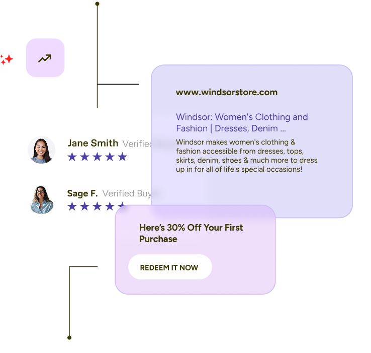
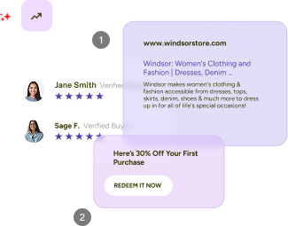
Get The Most Effective Flow since Cart Abandonment.
Feed the most relevant recommendations into your high intent event flows.
-
1
Get The Most Effective Flow since Cart Abandonment.
Feed the most relevant recommendations into your high intent event flows.
-
AI Boost Your SMS Marketing.
Tap AI product recommendations for high SMS CTR.
-
2
AI Boost Your SMS Marketing.
Tap AI product recommendations for high SMS CTR.


